
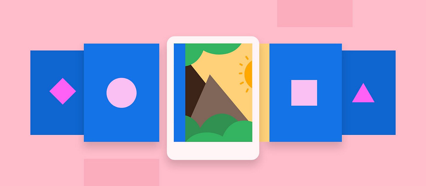
Carousels are auto-rotating panels, generally with some form of navigation, usually emphasizing new product launches, specials, or deals. They can be seen on virtually every eCommerce site’s homepage — mainly because such sites need to show multiple products or variants of products in a small space.
But are they ever useful? Carousels are useful for informing marketing/senior management that their current concept has been included on the front page. But carousels are also known to distract, confuse, and irritate customers, especially if they are difficult to navigate or don’t act in an expected manner.
Almost all of the testing that has been done regarding the effectiveness of carousels has illustrated that most consumers miss material provided via carousels. Few people interact with them, and many people say they seem like advertisements, and most just glance past them.
In order to save real estate on the screen and promote content, several conflicting messages are presented in a single location, which might cause focus to be lost.
They are, without a doubt, a user-interface cliché spawned by their use in wire-framing programmed and their incorporation in JavaScript frameworks.
Why are carousels useless?
Not only do these carousels prove to be ineffective, but they serve little to no purpose overall. Website designers and content writers should remember usability principles like sustaining a sense of location and keeping users in control while employing innovative interactions like a carousel.
- There is no way to bookmark a specific item on the carousel.
- Flash carousels that don’t let users to right-click on an item and choose “open in new tab/page.”
- Carousels with unpredictably non-intuitive navigation, such as spinning material for no apparent reason just because your mouse hovered over it.
- It might be difficult to navigate a carousel with a lot of options. A carousel paradigm allows for rich navigation, as the carousel changes “pages” that each provides their own set of navigation options via links or embedded objects.
Within this sort of navigation method, we’ve seen people become lost or miss important messages. Labels, headers, and other visual cues should be used to indicate location and navigation possibilities by interaction designers.
So, what do the surveys have to say?
Three types of automatically changing carousels for a news site were examined using an eye tracker in research done in the past. Despite the fact that the thumbnail form of the carousel is easier to browse, consumers considered all carousel variants to be equally distracting.
Suppose you’re going to use a carousel element. Eye tracking findings recommend that you should put navigational components above the display elements and use a navigational design that clearly signals the shift from one narrative to the next.
Can carousels be made effective?
Not all hope is lost when it comes to this form of UI element.
Carousels in a prominent location on a website capture users’ attention and may be an effective UI feature for attracting customers to its content. They are ineffective when the attention should be on other material on the page since they are aesthetically appealing and distract users.
Soft transitions with correct timing and control features, such as pausing, have been recommended to minimize distraction. Labelling, thumbnailing, and timing of the carousel parts should all be investigated to improve navigability and increase its effectiveness.
Carousels are the perfect design choice when the number of products in your catalog is more than can be comfortably shown on a single page. Carousels help to more easily navigate long catalogs, especially by using category-specific carousels that appear on category pages.