In user interface design, the busy spinner is a common delay or progress indicator. However, it has faults of its own that user interface designers frequently overlook. For all waiting indicators, several designers use spinners. Using spinners for lengthy processes can leave your users dissatisfied. Spinners don’t provide users with an estimate of how long a process will take. If you use it for a longer time, users may begin to suspect that the application is stuck and abandon it.
In general, the spinning animation is a good match for a brief load. Whenever possible, make your users aware of how long a process will take. If you can’t provide a sense of progress, at least let users know that the application hasn’t crashed.
At what point does a user lose trust in a Busy Spinner?
- 0.1 second: Limit for users who perceive themselves as having direct control over the user interface (UI). In other words, after a user chooses one column in a table, the user has to wait until that column is highlighted or otherwise provides feedback that it has been picked. Sorting the column should, in theory, have a similar reaction time, so users will believe they are sorting the table.
- 1 second: It’s important to set a time limit to prevent users from getting the impression that they’re being held up by the computer. Although the delay is slight, users will feel as though the computer is operating on their command when there is one of these 0.2–1.0 second delays. If sorting a table by a selected column takes more than 0.1 seconds, users will perceive the UI as unresponsive and lose the rhythm of their activity, which can lead to frustration. Show an indicator to the user that the computer is working to fix any delays greater than one second, such as changing the cursor’s form.
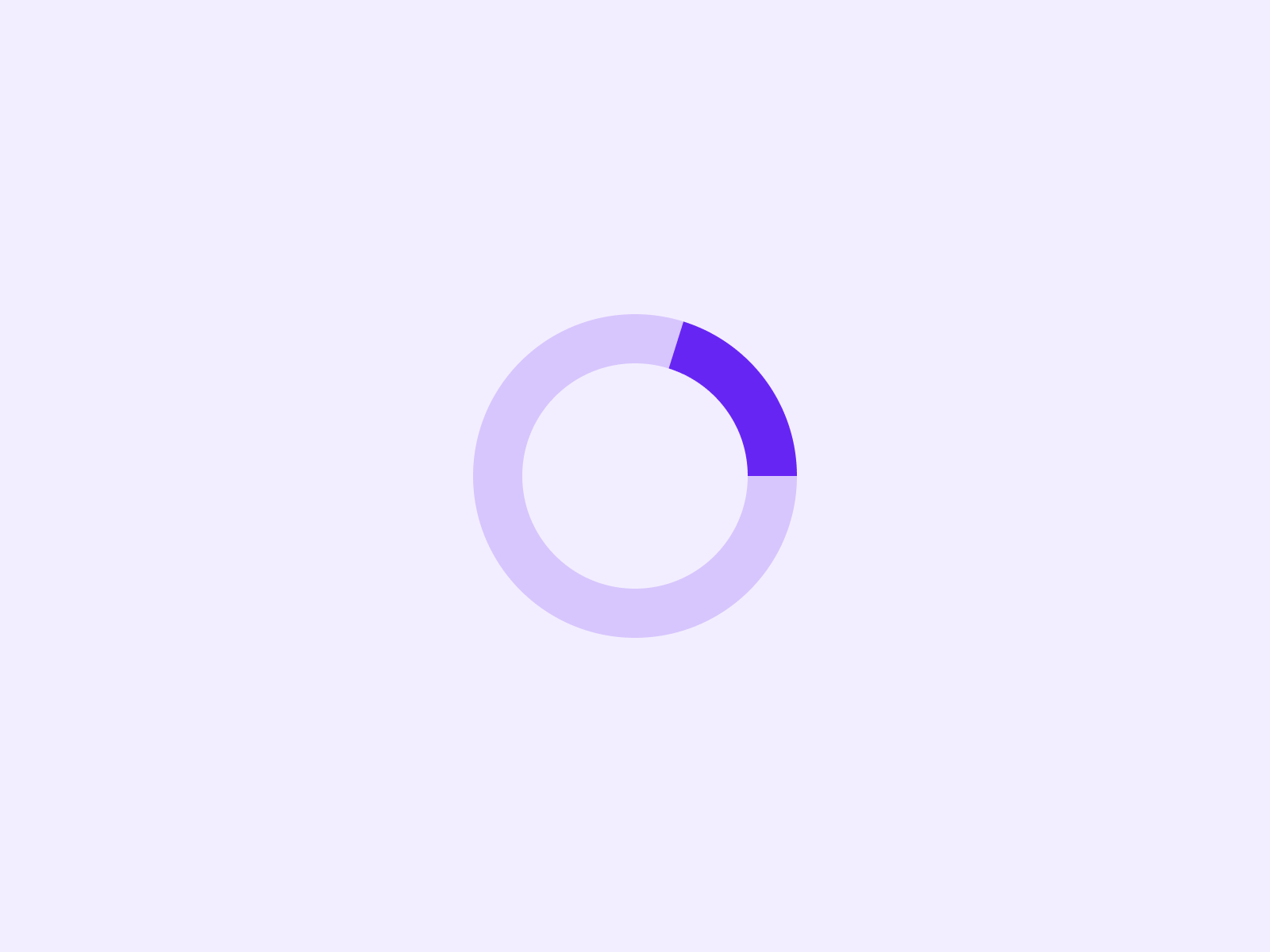
- 10 seconds: There is a time limit for users to stay focused on the task at hand. There should be a percent-done indicator and a clear way for the user to halt any activity that takes more than 10 seconds. Use the UI delay of greater than 10 seconds to assume that users need to get reoriented.
Alternative to Busy Spinner
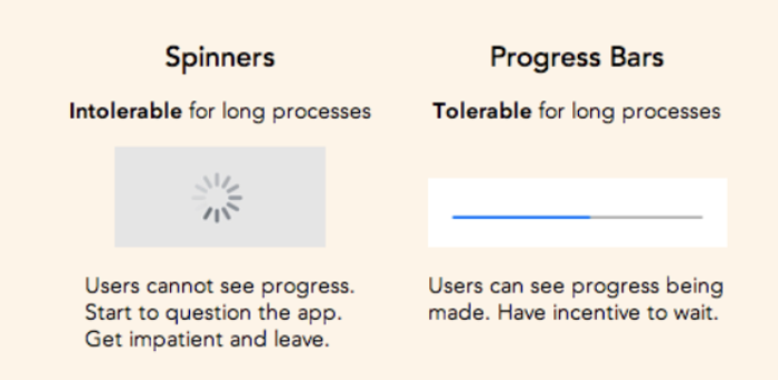
Longer processes become more manageable with the use of progress bars. Previously, we talked about how progress bars can be optimised. Users don’t mind waiting as long as they know something is being performed in the background to make their experience better. The duration of time it takes for your content to load may be minimal.
However, if you use spinners, it will look to be longer.
A progress bar and an estimated time remaining are both appropriate if the processing takes longer than a minute. This makes the delay more manageable by increasing the degree of predictability.
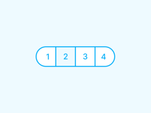
To indicate to users how far the system has come, a progress bar is required. From left to right, your bar should animate gradually and consistently. If the animation pauses for an excessive amount of time, users may believe it has stalled and won’t bother waiting (2019).
You should use a progress bar if the processing or loading takes longer than 10 seconds. Therefore, it is recommended to use a percent-done animation for longer processes.
Happy designing!