The amount of big data being generated is rapidly increasing. Harmonizing complicated data requirements with a clear, clean, and usable user interface, on the other hand, is a challenge for every UX designer today. We are here with some tips for designing a data-heavy UI.
Table of Contents
How to display too much data?
A table is an effective way to show a large quantity of information. Tables containing more than 5 columns, on the other hand, become illegible rapidly. If your data is altering in real-time, as you claim, the user would most likely be unable to make a choice in time if he is required to glance at 15 distinct columns simultaneously.
When looking at a big quantity of data, Google recommends sorting as an essential factor. You must sort by relevance to the user. Every piece of data is essential, but some parts are more vital than others. You must choose which bits are the most important and which are not, which is mostly dependent on the business purpose.
Other solutions
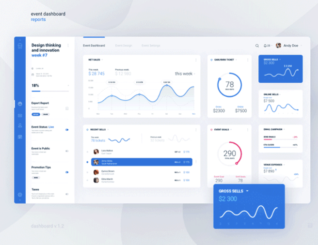
Here are some strategies you can use to show data:
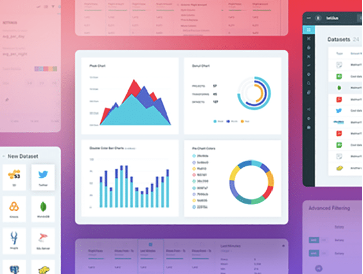
- Line graphs are used to depict continuous data, such as how something has evolved through time.
- Tables are used to present summary data.
- Histograms are used to demonstrate how variables are distributed and to depict quantitative data in intervals.
- Showcasing discrete data, comparing variables, and showing categorical data using bar graphs.
Prioritize function over form
Contrary to common opinion, this design idea is more about utility and minimalism than a dreary two-dimensional design. Flat design, on the other hand, is neither boring nor uninteresting. Bright colors, clean-cut edges, and wide spaces are all available to you.
For mobile applications, websites, and desktop browsers, flat and material design is highly encouraged. Since the design is simple and does not store a lot of data, it loads quickly and, when designed to increase interaction, can assist maintain visitors on the page for extended periods of time.
This is ideal for websites that are data-driven that need to be mobile-friendly, load quickly, and have lower bounce rates.
The key elements for UX designing
Observing and implementing a hierarchy of information, such as visual hierarchy, is an important UX design element. To put it another way, a design that prioritizes the appropriate metrics.
The most critical data should be organized, arranged, and prioritized first, followed by any new data. Naturally, the priority order will differ based on the application’s user. This not only declutters the dashboard but also helps users focus on what matters to them in an easy-to-understand, less overwhelming approach.
The next stage is to split down the data into distinct pages after sorting and ranking it on the dashboard. If the information can be organized, make sure to use distinct pages/screens for different data groups.
This may be used for both small and large data-heavy application design projects; however, it may take longer and require more back-end effort. In keeping with the “overwhelming” concept, doing so will not only make your user feel less intimidated, but they will also be more likely to analyze the numbers on one page before going on to the next, allowing them to better grasp the facts one step by step.