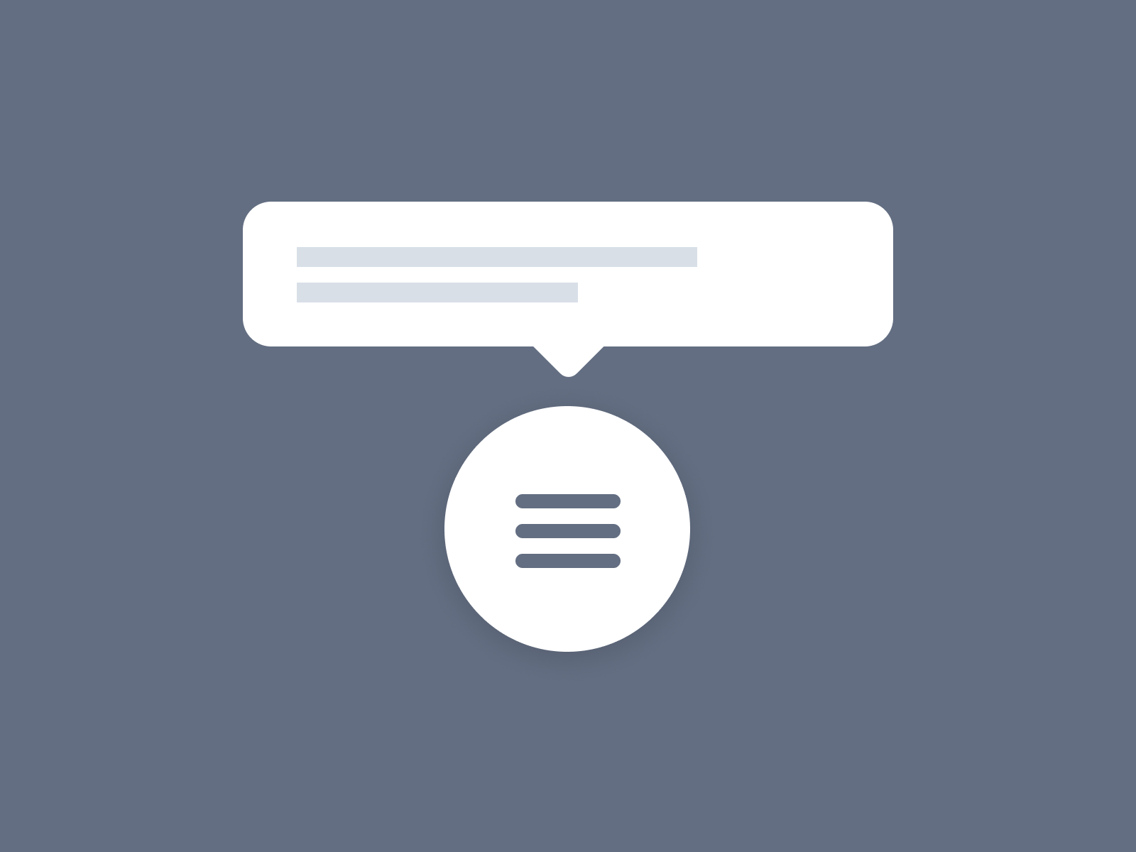
Tooltips are a great way to provide additional information to your mobile website visitors without taking up too much space on the page. But on mobile, you have to carefully craft the UX.
When used correctly, they can enhance the user experience and help you communicate more effectively with your audience.
However, there are a few things to keep in mind when using tooltips on mobile websites. In this article, we’ll share some best practices for creating effective tooltips that will improve the user experience on your site.
Table of Contents
1. Use Tooltips Sparingly
The first rule of thumb when it comes to using tooltips is to use them sparingly. Overusing tooltips can be annoying for users and can cause them to leave your site altogether.
Instead, only use tooltips to provide information that is truly necessary. If the information can be conveyed in another way, such as through the use of a link or an image, then it’s best to leave the tooltip out altogether.
2. Keep Them Short And Sweet
Tooltips should be short and to the point. Mobile users have limited attention spans, so you want to make sure that your tooltip contains only the most important information.
If you need to provide more detailed information, consider using a modal window instead of a tooltip. This will allow users to view the information at their own pace without being forced to interact with it immediately.
3. Use Positive Language
When writing tooltip content, always use positive language. For example, instead of saying “Don’t forget to sign up for our newsletter,” try something like, “Sign up for our newsletter to stay up-to-date on all the latest news.”
Negative language can be confusing and off-putting for users. By using positive language, you can ensure that your tooltip content is clear and easy to understand.
4. Use Actionable Verbs
In addition to using positive language, use actionable verbs in your tooltip content. For example, instead of saying “Click here to learn more about our product,” try, “Learn more about our product by clicking here.”
Actionable verbs make it clear to users what they need to do in order to get the information they’re looking for. This can help reduce confusion and improve the overall user experience on your site.
5. Test Your Tooltips
Before you launch your tooltip campaign, it’s important to test it out first. Send a test tooltip to a few friends or coworkers and see how they respond.
Do they find the tooltip content helpful? Is it easy to understand? Are they able to take the desired action? These are all important things to consider when testing your tooltips.
By following these best practices, you can create effective tooltips that will improve the user experience on your mobile website.
Just remember to use them sparingly, keep them short and sweet, and make sure the content is actionable and easy to understand. With a little bit of planning, you can ensure that your tooltips are a valuable asset to your mobile website.
When Should You Not Use Tooltips?
Tooltips can be a great way to provide additional information to your users, but there are some circumstances where they may not be the best choice. Here are some situations where you might want to reconsider using tooltips:
- When the information is essential to understanding the content: If the information in the tooltip is something that your users need to know in order to understand the rest of the content, then it probably shouldn’t be in a tooltip. Tooltips should be used for supplemental information, not essential information.
- When the tooltip triggers are not obvious: If your tooltip triggers are not obvious, your users may have difficulty finding them. Make sure that the trigger elements are clearly visible and that their purpose is clear.
- When the tooltip content is too long: Keep the tooltip content short and to the point. If you have a lot of information that you want to include, consider breaking it up into multiple tooltips or using a different method altogether.
- When the tooltip may be disruptive: Tooltips can be disruptive if they appear at inopportune moments or cover up important parts of the page. Use tooltips sparingly and only when they will enhance the user experience, not hinder it.
How To Design Tooltips For Mobile Devices:
When designing tooltips for mobile devices, there are a few things you should keep in mind.
First, keep it short and sweet. Mobile users have limited attention spans, so your tooltip should get straight to the point.
Second, make sure the tooltip is easy to spot. Use a bright, contrasting color for the background and text to stand out from the rest of your content.
Third, use a large font size. Mobile users are likely to be viewing your site on a small screen, so it’s important to make your tooltip legible.
Fourth, keep in mind that on cursor devices the tooltip is hidden again on mouse-out. You can’t do that on touch devices, so make sure the tooltips are hideable by a double-click (the first click opens the tooltip, the second closes it).
Finally, avoid using complex graphics or animations. Stick to simple text and icons so that your tooltip can be easily understood at a glance.
Common Mistakes To Avoid:
There are a few common mistakes that people make when using tooltips on mobile websites. Here are some things to avoid:
- Don’t use tooltips as a replacement for clear and concise copywriting.
- Don’t use tooltips to provide entire paragraphs of text.
- Don’t make the tooltip too small or difficult to spot.
- Don’t use complex graphics or animations. Stick to simple text and icons.
With these best practices in mind, you can start using tooltips on your mobile website with confidence. By following these guidelines, you can ensure that your tooltips are effective and improve the overall user experience of your site.
What Makes A Good Tooltip?
Tooltips are a great way to provide additional information to your users without cluttering up your interface.
But what makes a tooltip effective? In this guide, we’ll explore the various factors that go into designing an effective tooltip.
First and foremost, a tooltip should be concise. It should convey the most important information in as few words as possible. Be careful not to include too much information in a tooltip, as this can make it difficult to understand.
The timing of a tooltip is also important. If a tooltip appears too early, the user may not have had time to process the information it contains.
On the other hand, if it appears too late, the user may have already moved on and forgotten about the information.
The position of a tooltip is also important. If it appears in an unexpected place, the user may have difficulty finding it. On the other hand, if it appears in a place that’s too easy to find, the user may find it intrusive.
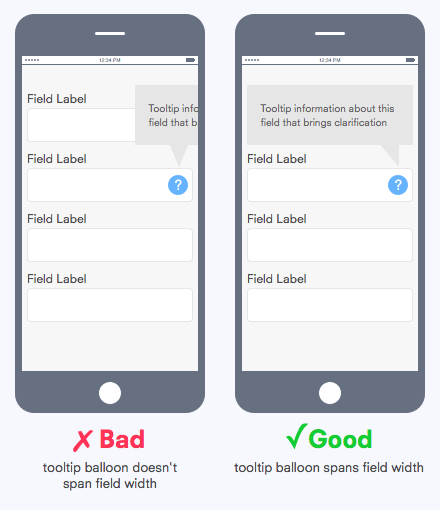
Finally, the visuals of a tooltip are important. The tooltip should be easy to see and understand at a glance. It should also be consistent with the overall design of your interface.
By taking all of these factors into account, you can create an effective tooltip that will help your users get the most out of your interface.
How Do Tooltips Help SEO?
There are a few different ways that tooltips can help improve your website’s SEO:
1. Tooltips Can Improve Click-Through Rates (CTRs)
One of the main goals of SEO is to get people to click through to your website from SERPs. After all, what good is ranking high if no one is actually clicking on your listing?
Tooltips can help improve your website’s CTR by providing additional information that encourages people to click.
For example, if you have a tooltip that displays the URL of the linked page, that might be enough to convince someone to click who otherwise wouldn’t have.
2. Tooltips Can Help Reduce Bounce Rates
Bounce rate is the percentage of visitors who leave your website after viewing only a single page. A high bounce rate is generally seen as a negative signal by search engines because it indicates that people aren’t finding what they’re looking for on your website.
Tooltips can help reduce bounce rates by providing extra information that keeps people engaged with your website.
For example, if someone is hovering over an image, a tooltip with additional information about that image might be enough to keep them from leaving.
3. Tooltips Can Help Increase Time on Site
Time on site is another metric that search engines take into account when ranking websites. In general, the longer someone spends on your website, the better.
Tooltips can help increase time on site by providing visitors with extra information that they might want to check out.
For example, if you have a tooltip that displays the URL of a linked page, someone might take the time to copy and paste that URL into their browser to see where it goes.
4. Tooltips Can Help Improve Engagement
Engagement is another important metric that search engines look at when ranking websites. In general, the more engaged someone is with your website, the better.
Tooltips can help improve engagement by providing visitors with additional information that they might find interesting or useful.
For example, if you have a tooltip that displays the URL of a linked page, someone might be more likely to click through if they know where that link is going to take them.
5. Tooltips Can Help Increase Social Shares
Social shares are another metric that search engines take into account when ranking websites. In general, the more social shares a website has, the better.
Tooltips can help increase social shares by providing visitors with extra information that they might want to share with their friends or followers.
For example, if you have a tooltip that displays the URL of a linked page, someone might be more likely to share that link if they know where it’s going to take their friends or followers.
Conclusion
Tooltips are a great way to provide supplemental information to your website visitors without taking up too much space or overwhelming them with text.
By following these best practices for tooltips on mobile websites, you can create an informative and user-friendly experience that also helps with your SEO efforts.