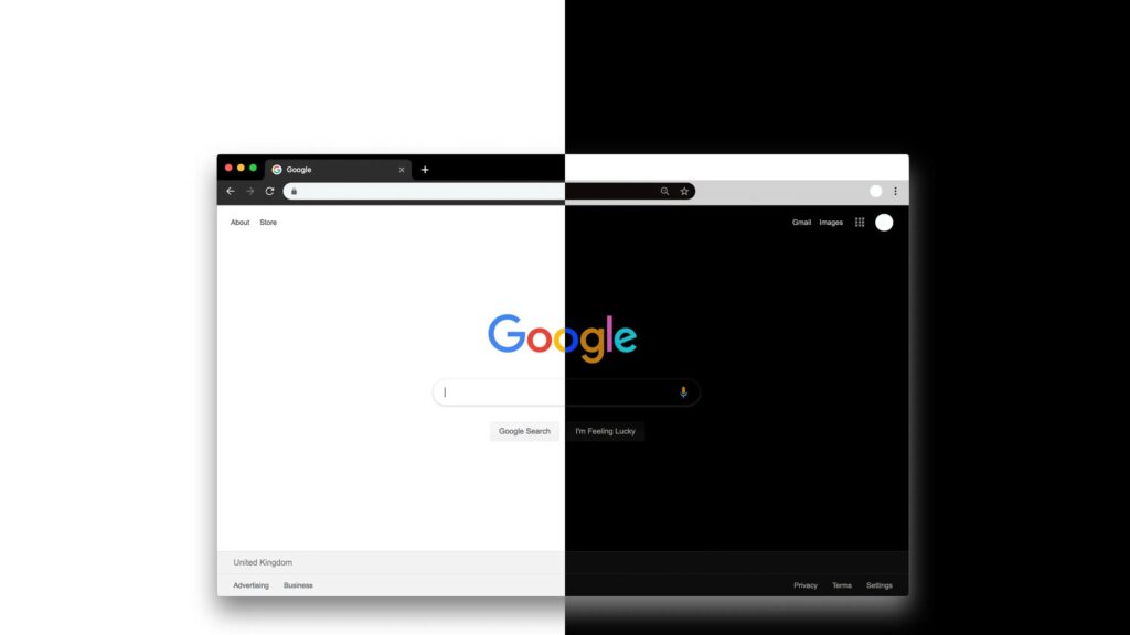
In the past few years, we have seen a lot of desktop, web and mobile applications provide users with an option of switching to a dark colour scheme or dark mode. Even the big social media websites like Facebook and Twitter – and now LinkedIn – all have a dark mode feature. Darker colour schemes are often used effectively in software that focuses heavily on visual content.


Dark colour schemes are generally easier on the eyes than the more traditional light ones. Why is it not widely used? Dark colour schemes are not that commonly used. This is because most people are used to the light colour schemes, they are familiar with them, and they prefer them. However, for most applications, users can choose to switch to a light or dark colour scheme.
Pros and Cons of Dark Mode
Dark-on-light vs light on dark themes can have multiple effects, such as:
- Dark mode brings the users’ attention to the application’s contents. This helps users focus on the task at hand and keeps them focused. People focus on brighter areas — darker background brings attention to the content.
- Dark mode is not the best option for readability. It is hard to read small text on a dark background. With bright on dark text, the text seems to expand (since the human perception makes brighter objects glow) and this makes it hard to read bolded text.
- Dark makes screens easier to look at for a long period of time or in different environments. It helps users to focus on the content, and it is easier on the eyes.
- Dark colour schemes may also be more suitable for users with vision problems such as macular degeneration. It reduces eyestrain in low-light conditions.
- Dark mode can be used to make the application look more premium, sophisticated, or artistic.
- The dark theme can help increase contrast when it is used alongside a light background. The contrast ratio of the foreground and the background is increased.
- Dark colour schemes can help you create a consistent colour scheme for your app. And if you already have a light UI, this can be achieved programmatically – using CSS or Figma.
- Dark mode has the potential to reduce battery life, but it is hard to recognize the difference.
- Some users may find it easier to navigate on a dark background, especially when they are in a reduced-light environment.
Conclusion
Dark colour schemes are not for everyone. Some people prefer light colour schemes while others prefer dark colour schemes. Some people like to switch between both. There is no absolute right or wrong, but there are many benefits of using a dark mode that will help users be more productive.
As designers, you can decide what colour scheme to use for your app or website. There are many factors to consider when making this decision, but the main factor is the user experience. Sometimes you may need to adapt to the user’s preference but in most cases, you should do what works best for your users.


