A switch is used by almost all of us every day. And although there are sometimes general norms in countries as to which direction is “on”, there is variation between countries.
In the UK, it’s most common for a switch to be on when the arrow is pointing upwards. While in the US, it’s most common for it to be on when the arrow is pointing down. The difference between these norms is subtle, yet it can be hard to get used to if you’re not used to it. So there is really no direction globally true as to which way is “on”, it is up to the country which they use.

The important thing is not so much which direction is correct, but that you make it visually clear when the switch is ‘on’ or ‘off’ in its design. This can be done by lighting up an LED, by an icon on the display, or by a physical switch that is raised to indicate its “on” state.
Generally, I would recommend Up and Right as ‘on’ but as I’ve already said, if the switch isn’t labelled, any direction has the potential for frustration if the user doesn’t know which way is on. If you’re designing a switch that is to be used worldwide, I would recommend that you add a visual cue to help the user understand which way is ‘on’.
Physical Switches
As a designer, you should not feel the need to include a tactile switch in your designs if your application doesn’t require it. It would be a waste of money and time, and you’re more than likely better off just using a visual symbol. That being said, if you’re designing a piece of equipment for use by the visually impaired, then it is your duty to include a tactile switch. In the US, electrical codes (see National Electrical Code paragraph 404.6 – 404.7) require switches to be mounted so that gravity will not tend to close the circuit. The switch must also be mounted with a mechanical interlock to prevent the switch from being turned on if it is open.
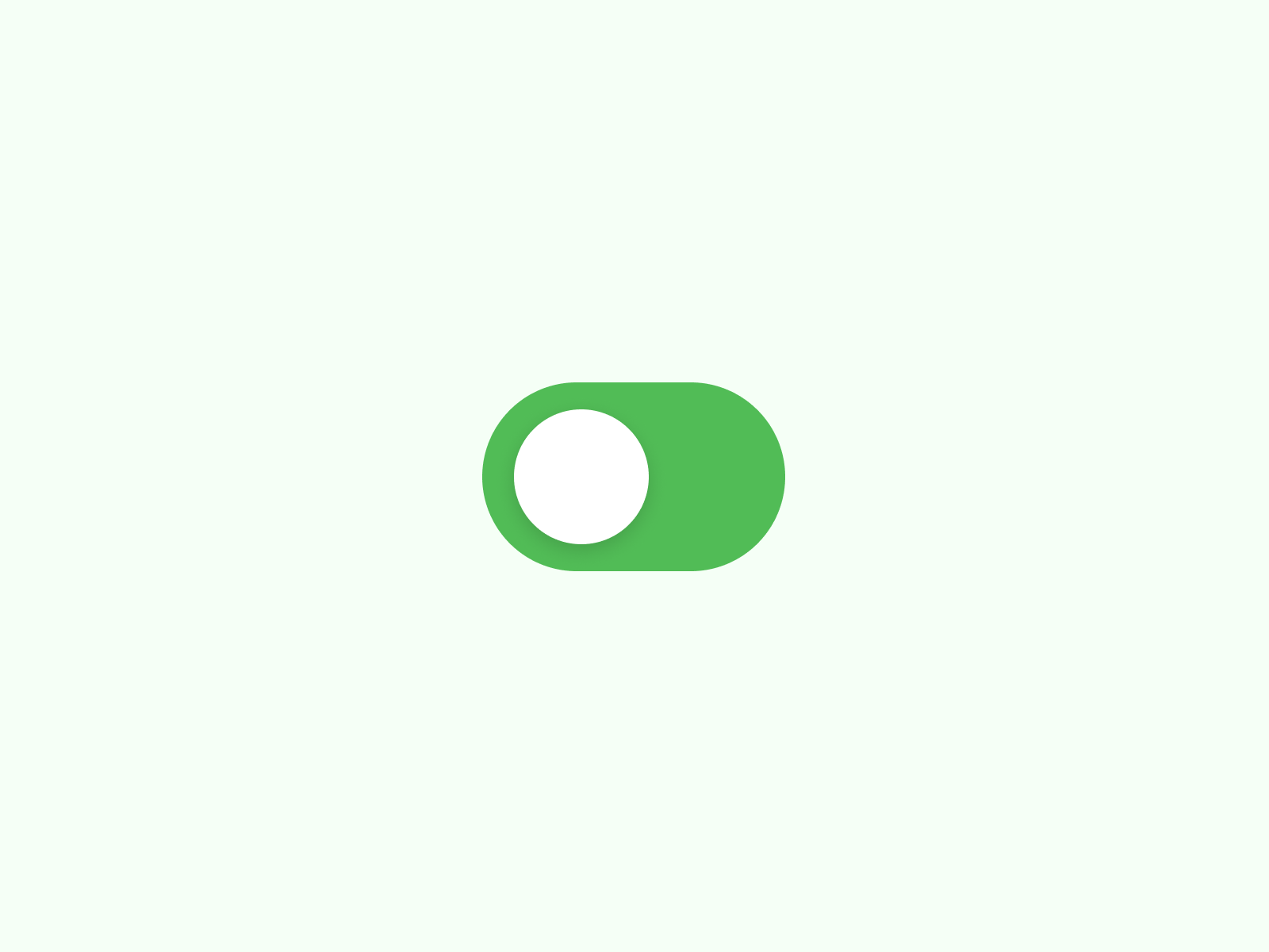
UI Switches
The conventions used in physical switches are translated into how UX designers design interfaces and experiences such as a toggle switch component. The UX design pattern of a toggle switch can be implemented in any interface that needs to be turned on or off. These are often used for settings, accounts, or security features.
When designing the UX for this component, you’re faced with a choice of how to indicate the on or off state. You can choose to use an icon, which is generally the most common approach, or you can choose to use an on or off state. Using an icon to indicate an on or off state is a common choice because an icon can be used to represent many things, and is, therefore, the most flexible. When using an icon, it is clear to the user what the icon represents and what will happen when they interact with it. Moreover, you can keep the direction of ‘on’ towards the label if the component is inline. Displaying text feedback would further improve the UX.