Hermann Grid illusion is a visual illusion in which the horizontal lines of a grid appear to be sloping. The effect is named after the German psychologist, Ludimar Hermann, who first described it in 1892. The illusion is often demonstrated by placing a printed grid on top of a rectangular aperture in a card or board. If you stare at this grid from a distance, you will notice dots forming at the corners.
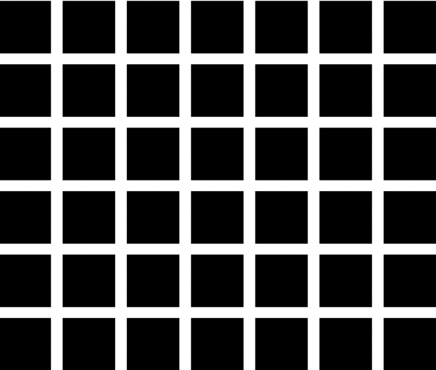
Hermann grid is a simultaneous lightness contrast illusion. This illusion like others is a misperception of relational properties between the constituent elements. The question is, are we perceiving the white spacing inaccurately or are we hallucinating white dots appearing at the intersections?
Guidelines for fixing Hermann Grid Illusion
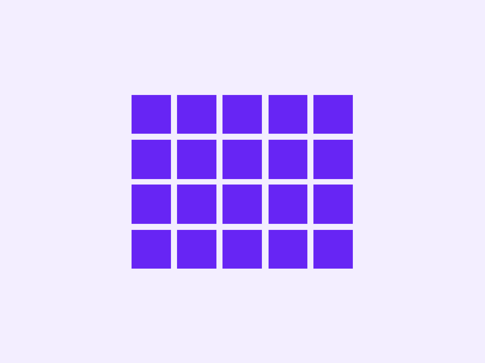
If you are designing a UI for an image gallery with 3-4 images in a column and multiple rows, using rounded corners will cause a Hermann Grid illusion. You can avoid it using the following techniques:
- Avoid using a square elements with rounded corners and make sure that there is appropriate blank space above and below the square.
- Use a rectangular image with rounded corners.
- Put the images closer together to lessen the illusion and use screen real estate more efficiently.
- You can reduce the bright areas further by removing rounded corners at intersections. This practically eliminates the illusion.
- Use rounded corners with a drop shadow that is dark and clear.
- Reduce the contrast by making the background darker.
- Avoid using dark and heavy grids.
We would love to hear your thoughts and learning about Hermann Grid Illusion. Share them in the chat section below.