
It is a common design question: should designers use white text on a black background or the opposite? The answer, of course, is that it depends on the situation. In this article, we will explore the pros and cons of each option to help you make the best decision for your project.
Bottomline, black text on a white background works better.
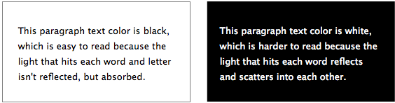
Table of Contents
Color Blindness
The first thing to consider is the audience. If the majority of your users have some form of color blindness, then white text on a black background may be a better option, as it will be easier for them to read. However, if your users are mostly young and have good vision, then black text on white background may be a better choice.
Device or Platform
Another thing to consider is the device. If your users will be accessing your site on a mobile phone or tablet, then white text on a black background may be a better option, as it will be easier to read in low-light conditions. However, if your users will be accessing your site on a desktop computer, then black text on white background may be a better choice.
Overall Visual Design
You should also consider the overall aesthetic of your site. If you want your site to have a clean, modern look, then white text on a black background may be a better choice. However, if you want your site to have a more traditional look, then black text on white background may be a better choice.
Accessibility
There is a lot of debate about the best color scheme for accessibility. Some designers prefer light text on a dark background, while others prefer the reverse. There is no definitive answer, but there is a body of research that suggests light text on a dark background is easier to read for most people.
One of the earliest studies on the topic was conducted in 1980 by Bauer and Cavonius. They found that participants were 26% more accurate in reading text when it was presented with dark characters on a light background.
Other studies have shown similar results. In general, dark text on a light background is easier to read than light text on a dark background. This is especially true for users with astigmatism, which is common vision impairment.
Conclusion
Ultimately, the decision of whether to use white text on a black background or the opposite depends on the situation. Consider the audience, the device, and the overall aesthetic of your site to make the best decision for your project. It is better to use dark text on white background in most cases.