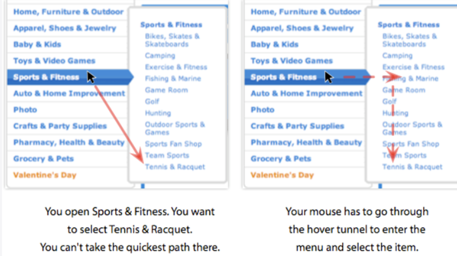
This dropdown anti-pattern is referred to as a ‘Hover tunnel.’
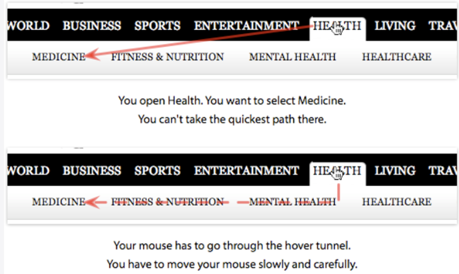
Hover menus require users to navigate their mouse through hover tunnels, which is one of the worst things about them. Hover tunnels are pathways through which users must manoeuvre their mouse to choose an object. This is sometimes difficult for older people who are less tech-savvy, and even the most tech-savvy consumers may find it inconvenient to move their mouse in a restricted route.
The ‘anti-pattern’ could be a result of the hover tunnel collapsing since it would not be a reliable means to drive visitors to advertisers or other information otherwise.
Table of Contents
Dropdown menus
There are several types of dropdown menus available. Only some work well and they are mostly created in JavaScript. Dropdown menus like this don’t function well with search engines. You should construct the menu in HTML from the start of the page load, rather than creating it in javascript client-side once the page has loaded, to allow search engines to index your website.
Use of dropdown menus
The primary rationale for dropdown menu use is that they are useful for saving space. Dropdown menus aren’t often thought of as a usability-improving method because they can be challenging to operate and hide information. However, dropdown menus can be a good option for saving space and can be used effectively.
Flyout menus enable you to only see the top levels of a page’s hierarchy on a permanent basis while still allowing you to see deeper levels when you hover your cursor over them.
Complex websites frequently use indented navigation. When a website has thousands of pages, micro-websites, and hundreds of subsections, the navigation will ultimately become deep and broad. And, with such complicated multi-level navigation, displaying the range of possibilities takes up a lot of space.
It’s no surprise that exposing clients to a great amount of navigation rapidly is a popular approach to deal with this complexity. That’s why mega-dropdowns have become something of an internet tradition — but mostly for difficult and huge enterprises. A mega-dropdown is a huge overlay that emerges in response to a user’s activity.
Dropdown menus frustrated users
For decades, one of the most typical behaviours for this type of navigation has been to open the menu when the mouse hovers over. It is also one of the most prevalent user complaints about this design has been the complete lack of predictability and control over how and when the sub-navigation operates. The submenu appears and vanishes abruptly, and it occasionally lingers on the screen for a long time even if the mouse cursor is already in a different area of the page or on a different page entirely.
The problem with menus: They can be hard to locate and interpret, and they often require that users click to open them, adding a second step to the user’s task. The result is that users often miss the menu and then fail to find the navigation they’re looking for, or they click on the menu and then find that the button they want is actually not there.
In the late 90s, a new design began to emerge from the field of Human-Computer Interaction. This new design is based on a simple principle: the controls which are the most important to users should be the most visible, approachable, and easy to use. This is not a new idea – it is something that has been known about usability for decades, but it is only now beginning to be applied to web design. The idea is so simple and obvious that you might wonder why it took so long to be applied, and it’s a good question: Why has it taken so long?
The Solution
One idea for a term for a solution is directional menu aiming. It demonstrates how Amazon detects the path of the mouse to prevent customers from picking an undesired element when hovering over their ‘mega-menu without requiring delays.
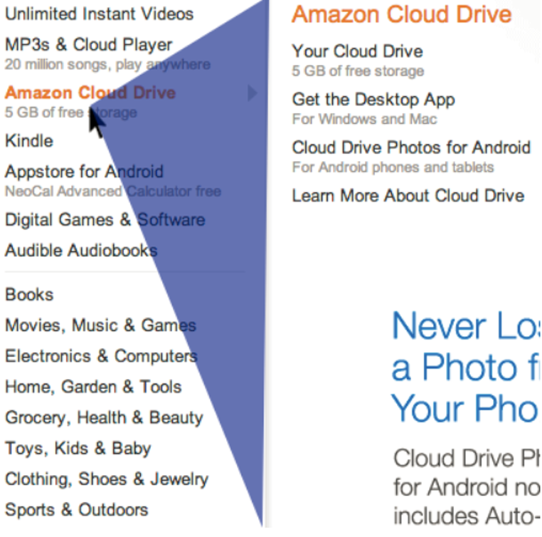
Imagine a triangle between the current mouse location and the top and lower right corners of the dropdown menu for every position of the cursor. The user is most likely moving their cursor inside the presently shown submenu if the next mouse position is within that triangle. Amazon uses this pattern. The current submenu will remain open as long as the pointer remains within that blue triangle.