UX Best Practice for Infinite Scrolling
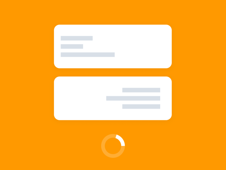
Reading Time – 6 min Infinite scrolling is a popular UX pattern that can be seen in a variety of online applications. It allows users to scroll through a large amount of content without having to click through pagination links.…