
Hamburger menu icon: should it be on the left or right?


Table of Contents
Quick answer: put the hamburger menu where its panel opens. In native apps with a side drawer or sidebar, that is the top left, because Apple and Android both place the sidebar on the leading edge. On responsive websites, where the logo usually takes the top left, the top right is the common and perfectly usable choice, and it is easier to reach with a right thumb. Better still, if you only have four or five main sections, skip the hamburger and show them in a bottom tab bar.
Updated August 2026. Since this was written, most major apps have moved primary navigation to a bottom tab bar on mobile; the hamburger icon now mostly holds secondary items. The left-versus-right arguments below still apply to whichever items remain in it.
The hamburger menu icon is one of the most ubiquitous icons on the web. It is usually used to indicate a menu bar, and it is often placed in the top-left corner of the screen. But there is some debate over whether the hamburger menu icon should be on the left or right side of the screen.
Brief History
The hamburger menu icon was first introduced in the early days of the web (when we did not design for mobile screens), and it was usually placed in the top-left corner of the screen. This was because the top-left corner was the traditional location for the menu bar. But over time, the hamburger menu icon has been used in other locations, including the top-right corner of the screen.
Right or Left?
There are several arguments for why the hamburger menu icon should be placed on the right side of the screen. The first argument is that the right side is the traditional location for the main navigation menu. The second argument is that the right side is the location of the main action buttons, such as the “submit” button – although I personally do not like it. The third argument is that the right side is the location of the global navigation menu.
There are also several arguments for why the hamburger menu icon should be placed on the left side of the screen. The first argument is that the left side is the traditional location for the menu bar. The second argument is that the left side is the location of the primary content area.
So, which side is the best location for the hamburger menu icon? There is no definitive answer, and it depends on the specific website or app. However, the general consensus seems to be that the hamburger menu icon should be placed on the right side of the screen for most responsive websites. Native apps are the exception: Apple’s guidelines describe a sidebar as something that “appears on the leading side of a view”, which is the left in left-to-right languages, so a menu button that opens it belongs on the left too. In right-to-left languages such as Arabic and Hebrew, mirror all of this.
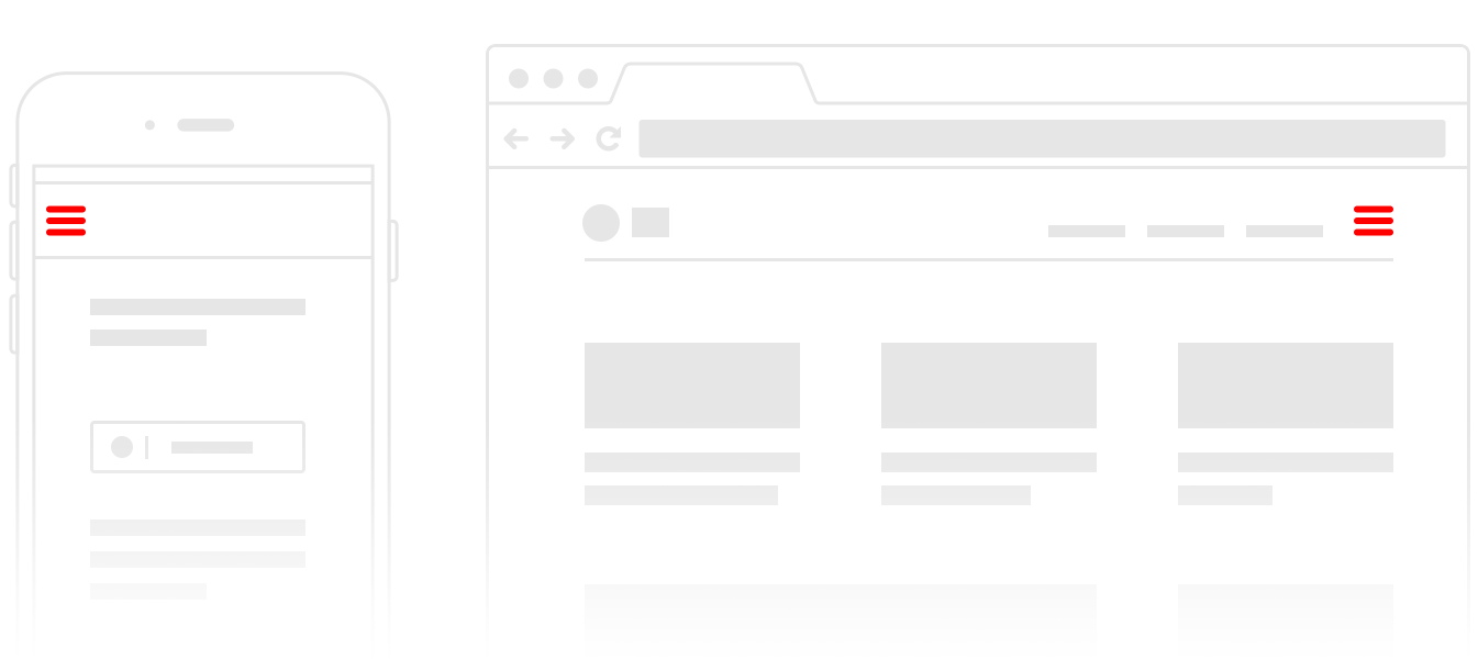
Mobile Screens
On mobile screens, you must put it on the top-right if the menu icon must go on top. Otherwise, the best alternative is to not have it on the top at all. This is because the top part of the screen is not reachable by the thumb on most devices, making it difficult or impossible for users to access the menu.
Hamburger menu vs bottom navigation
The more useful question is often not left or right, but whether the menu should be hidden at all. Nielsen Norman Group tested hidden, visible and combination navigation on real sites. Hiding the navigation cut content discoverability by more than 20%, and on mobile, people used the navigation in 57% of tasks when it was hidden behind a hamburger versus 86% when some of it stayed visible. Their advice: never hide navigation on desktop, and on mobile show it when you have four or fewer top-level links.
Apple’s tab bar guidance makes the same point from the other side: keep the tab bar visible as people move around the app, because “if you hide the tab bar, people can forget which area of the app they’re in.”
| Hamburger menu | Bottom tab bar | |
|---|---|---|
| Best for | Many destinations, or secondary items (settings, help, legal) | 3 to 5 main sections people switch between often |
| Visibility | Hidden until tapped | Always on screen |
| Thumb reach | Poor at the top of a large phone | Good, it sits where the thumb already is |
| Shows where you are | Only when opened | Yes, the active tab is highlighted |
| Room to grow | Plenty | Tight; extra items end up behind a More tab |
Most well-known apps now combine the two: a tab bar for the main sections and a menu or profile screen for everything else. If your menu icon is doing a different job, such as opening actions for one item, you probably want a kebab rather than a hamburger; see our guide to hamburger vs kebab menus.
Test with Users
The best way to decide where to place the hamburger menu icon is to test it with users. Try out different locations and see which one is the most user-friendly. You may also want to test different icon designs, as users may have different opinions on which design is the most user-friendly.


