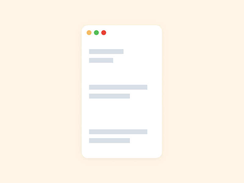
Having a website with a minimalistic outlook is the latest trend, but it also offers usability benefits; there is less noise clutter, and users can find the content more quickly. The eye and brain have to process more information when there are more objects on the screen which is why empty spaces on websites reduce the number of attentional resources necessary to process the page.
Too much of it, on the other hand, can compromise readability and user experience.
Table of Contents
Why the empty space?
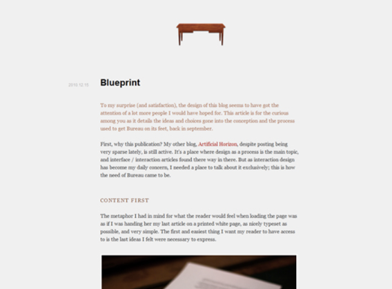
If your site primarily contains paragraphs of text, which your users want to read, this question is 100% correct – it is much easier to read text when the line length is 50-60 characters per line, including spaces. Many studies have proved this, which is why most novels use this line length as well.
Visual decluttering
Clutter is a common occurrence in our lives, and it’s a crucial factor to consider when designing user interfaces and data visualizations. Many existing visualization systems limit what items or information the viewer sees or employ non-linear zoom techniques to give objects in the center of the screen more area.
Tips for designing web pages, maps, and other visualizations frequently focus on displaying a vast quantity of data while minimizing clutter by carefully choosing how that data is represented and organized.
Hierarchy of information
The hierarchy of information is an overall layout idea that should be applied to all types of designs. It is the organization of components or information on a screen in a method that it shows a level of priority to the data that is displayed.
Consistency of structure
Assume you have a page that is full width. It will be 100 percent no matter what. 100% for someone using a tiny laptop and 100% for someone using a 24-inch monitor. It’s clear that a laptop user will view condensed information with a specified structure that will display pieces in a very particular way with a relatively precise quantity of data on the screen.
On that 24-inch monitor, the user will now see something completely different; the visual saturation and friction will be extremely high and the vertical projection of information will be different.
So in order to maintain consistency of structure, webpages opt to leave half of it empty.
Is my website’s webpage too empty?
You may want to modify the layout entirely for extreme size changes, either using a new style sheet or, more effectively, using a CSS media query. This doesn’t have to be a hassle; most of the styles can stay the same, but particular style sheets can apply these styles and use floats, widths, and heights to shift elements around.
You can detect this and transition to a new style sheet if a style sheet made the layout too narrow, short, wide, or tall. This new child style sheet would inherit everything from the default style sheet, with the exception of the layout’s structure, which would be redefined.