Creating the right UX for a tool where you need to capture and manage data can be very difficult. That’s especially true if you have some data in a table, and other data is in a text block. It can be very difficult to figure out how to properly align specific content, especially things like numerical values, currency amounts etch.
Thankfully, there are some best practices to focus on when it comes to data table cell content alignment, as you will notice below.
Table of Contents
The ideal way to perform cell content alignment
After considerable research, we at UX Pickle have shortlisted a very precise and specific system to help you align table data:
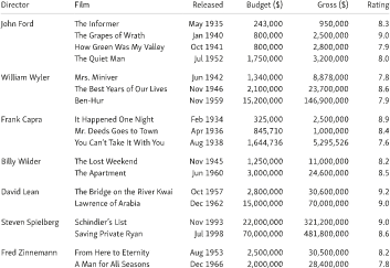
- If the column is text, then you should align it to the left.
- However, if the column has a number + unit or just a number, then you align it to the right, just like you would in Microsoft Excel.
- If you have a multi-part value that’s separated via a common separator, you can align using a separator.
- Another thing you can do is to align titles with data.
It’s a system that helps better optimize your data readability, while also making it easier to manage and access as well. It’s important to ensure that once you start using such an alignment system, you stick to it in order to maintain consistency. That will make it much simpler for you to adapt everything and the results as a whole will be second to none.
Always follow the alignment rules
You should stick to the guidelines and ensure that text is left-aligned, whereas numerical data stays aligned to the right. Another important aspect to follow here is that you also want to have the header aligned with your data. So if you have a text-based header, align it to the left. If it’s just comprised of numbers, align it to the right.
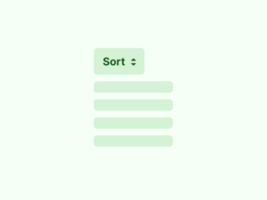
The recommended option here is to not use center alignment, unless it is an element like a checkbox or star rating. For text or numerical data, doing so makes it harder to scan entries, not to mention you need more graphical elements and dividers.
Significant Figures
Another thing you want to do is to maintain the number of the significant figures consistent. So, if you use 3 digits after a decimal, stick to that throughout. Ideally, you want to have fewer sig figs if possible. Doing that will just better optimize your alignment process and solve any problems that might arise.
Table Design
You need to keep in mind that whenever you align the data points in your table, you don’t need any rules. You can however keep them if you want to have less space between the elements. Rules should be light because adding too many of them will make data scanning a lot harder. You need to make things easier, so having fewer rules can make a difference.
Speaking of that, you also want to avoid adding backgrounds. Sure, some might say that using backgrounds makes it easy to highlight and align data. The problem here is that if you use colors, that might end up making the table harder to read. Keeping the table monochromatic reduces the chances of dealing with an error, and it’s stuff like that you need to focus on.
Conclusion
As you can see, there are many different rules to focus on when it comes to aligning cell content and making it easier to read. We recommend using all these tips and tricksto optimize your tables and make them more presentable and easier to use!
Read more about data tables: