
Are you testing the color combinations for contrast when you build color palettes for your web design projects? If you don’t, you may be overlooking the design’s long-term readability and so missing out on a valuable audience.
Avoid using textures and patterns as a background for text, as they might make letterforms challenging to read or even impossible to read. Use caution when combining text and background colors. The contrast between the color of the backdrop and the color of the body text should be at least 80%.
Since the contrast between foreground and background is critical to readability, black-and-white is your best bet.
Font design plays a role in determining whether black-on-white or white-on-black is the best option. The majority of personal computer fonts are intended for dark-on-light display. It’s usually best to stick with black-on-white if you use conventional computer fonts. For night mode, you may want to use white on black depending on how well your gadget performs when dimmed. This will help the pilot see everything else.
Because of the brilliant brightness of the white background, your pupils dilate, making it easier to read black text on a white background. Having a smaller pupil (like a smaller camera lens) makes it easier to focus your eye and lessens the influence of refractive faults in your eye.
Make sure that the color and value of the text contrast properly with the background. Text can appear blurry or haloed if there is not enough contrast between the color of the text and the backdrop color. This makes it difficult to read and results in eye strain.
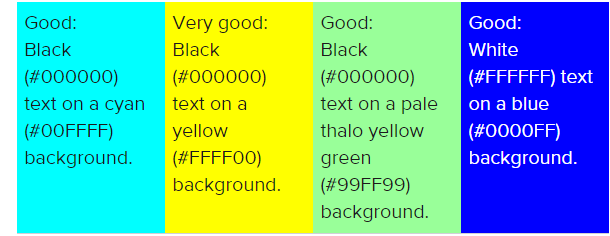
Black, grey, or white text on a high-contrast color backdrop often provides better legibility than text in distinct chromatic colors—unless the two colors contrast substantially in both hue and value—unless the text and background are in different chromatic hues.
Text or symbols with fine lines on a color background should not be used in grey because the color of the background color’s complement will appear in the text or symbols.
Green text on a red backdrop, red text on a green background, red text on a blue background, and other similar color combinations are among the most difficult to read because of their intense simultaneous contrast effect.
When the color of text and the color of the background have a simultaneous contrast effect, the text appears to vibrate, making it difficult to read and resulting in weariness and strain on the eyes.
Colors that are severely different force users to frequently refocus their eyes, resulting in visual discomfort and, in some cases, exhaustion.
The use of color conventions should be established as part of the design principles before beginning any application or website work.
Even if the use of color does not improve user performance, utilize color to enhance the visual attractiveness of an application or website. Colorful Web pages are preferred by most people, and user satisfaction is equally as important as user performance on the Internet. The use of color should not detract from the usability of the website and reduce the capacity of visitors to fulfill their tasks.