
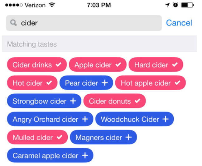
A multi-select pillbox is a suitable option if the user is familiar with the list’s content and knows precisely what they’re searching for. By searching or simply scrolling through the list, they can quickly locate what they are looking for.
In cases where the list’s content is unfamiliar, there are numerous problems. It takes a great deal of energy in order to go through such a big list and read each item. In addition to this, if it’s not ordered alphabetically, this is even worse.
Then just half of the time does their search return any results. For one reason or another, the content doesn’t match the list’s string order or usage. In the end, they give up and move on without actually selecting the most relevant tags.
However, it has been observed that the tags used were quite general and didn’t go far enough to aid the providers and improve the content quality and ranking of their listings, requiring a significant amount of additional research time and effort.
Choosing a solution is a matter of personal preference. Depending on the situation, a search bar or a basic list may be all that is needed.
The user will benefit if the list can be shortened if it is too long.
As stated by Hick’s Law, a person’s decision-making time relies on the number of options they have available to them. As the number of options grows, so does the amount of time it takes to make a decision. You can use tabs, filters, groupings, or a search engine to decrease the number of items on a list.
Is there anything you can do to make multi-select workflow design on mobile easier?
On desktops, there are a plethora of multi-select solutions. These, as expected, don’t work as well on mobile as they do on desktop. Some of these methods don’t work as well on mobile devices. In addition, item statuses and interactions with them are different in the two games.
Choosing something from a long list can be difficult while using a mobile device. Organizing an event with a big number of items can be time-consuming and exhausting. The cause for this is that it can be mentally taxing.
The amount of mental effort required to execute a given task is known as cognitive load. Utilization becomes more challenging as the load increases. By making objects, actions, and alternatives readily apparent, we can reduce the strain on the user’s system resources.
Conclusion
Choosing many items from a list has never been fun. On large screens, there are several novel solutions that work well, but on mobile devices, they are a complete nuisance.
For unfamiliar items, it’s best to show them rather than hide them. Create groups with relevant titles and allow users to zoom in on the groupings they’re most interested in.
As a result of reduced cognitive load, the task is completed in a shorter amount of time without tiring the user.