

Generally, the label is placed to the right of the control by the designer. What you’re sensing is most likely the rationale. There are no gaps between labels and controls in this layout when you use checkboxes with varying labels lengths.
This avoids label alignment issues that text boxes and dropdown lists have when using this arrangement.
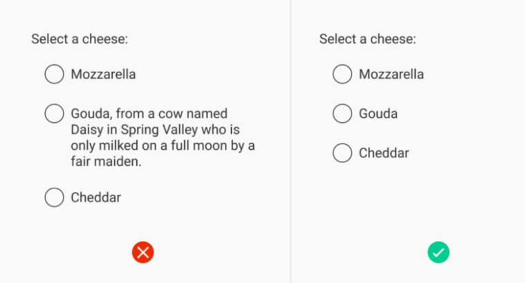
One of the most significant aspects is how quickly you can get a sense of what’s going on without having to go through each individual piece. It is important that checkboxes have a consistent width for this purpose.
Consequently, if you align one side of the checkboxes vertically, the other side will likewise be vertically centred, and so on. Stretching text is often not an option because the width of text might vary (which can make it very hard to read).
For LTR text, we should place the most significant words at the front of sentences, therefore left alignment should take precedence over right.
Checkbox Usage
The checkbox can be used in a variety of ways.
In a list of things, checkboxes for selection should appear ‘before’ the text (so, to the left in a left-to-right language like English). This allows you to align the items to the left while still keeping the checkboxes aligned without adding any more whitespace to the page.
As a result, the selecting mechanism is located at the beginning of the label, which is where people tend to scan rather than read the complete label.
No question about it, the checkboxes should appear first in a checklist. Users are scanning the checkboxes to see whether they have any actions to take.
In the context of other options, checkboxes may be placed after the label. However, in general, I avoid using checkboxes because they tend to be a little less communicative than other forms of input.
For example, the iPhone’s slider-box or a drop-down menu might be used to give the user more information than a simple “checked/unchecked” option.
Another consideration is the closeness of the relevant data.
Checkboxes placed to the right and vertically aligned will be further away from the labels than checkboxes placed to the left and horizontally aligned So it appears that placing them on the left side is the best option.
On the other hand, you must ensure that the form is consistent.
For example, putting a birthday input field to the left of its label can lead to an inconvenient flow in which the user has to return and go between the labels and the form controls in order to scan the form. Only use left-aligned controls if they are all the same width and length.
Using checkboxes in the right context
If you want the customer to be able to choose from a variety of options or none at all.
Use this picker if you want your users to be able to customise their pizza by choosing from a variety of different topping options. All, some, or none of the checkboxes could be selected by the user.


Labels for most fields are positioned immediately before the field, that is, for left-to-right languages, either to the left of the field or above it, and for right-to-left languages, to the right of the field or above it. Labels for radio buttons and checkboxes are positioned after the field.