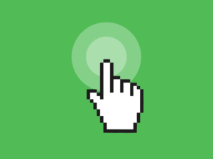
User interaction habits are altering as a result of flat buttons, and we can observe this in usability testing results. Users are compelled to sift through pages in order to discover what links can be clicked. As a result, they regularly stop what they’re doing and hover their mouse over an item, hoping for dynamic clickability indicators, or click to uncover potential links.
This exploratory behavior, even though users are able to navigate their way around interfaces, is nevertheless a nuisance and a distraction from their primary purposes.
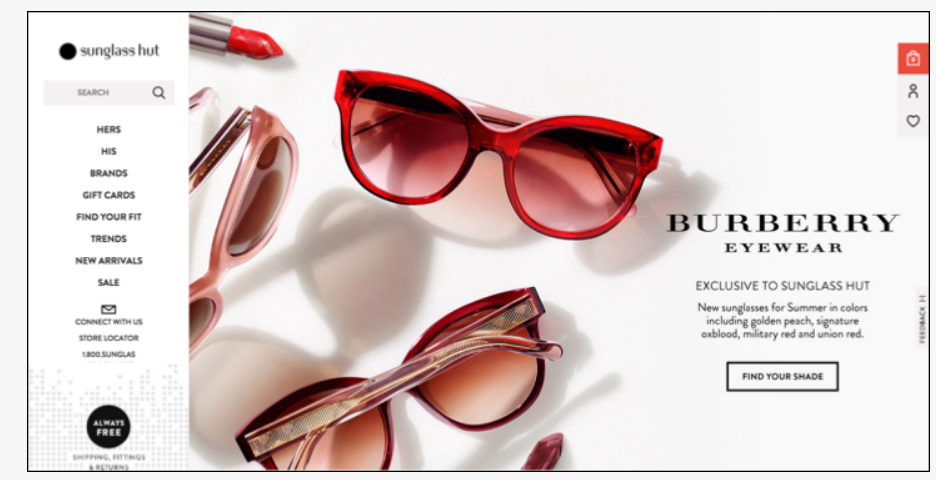
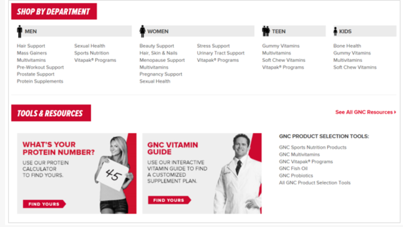
On this website, users are unable to determine which items are clickable since a similar text is used throughout the entire site.
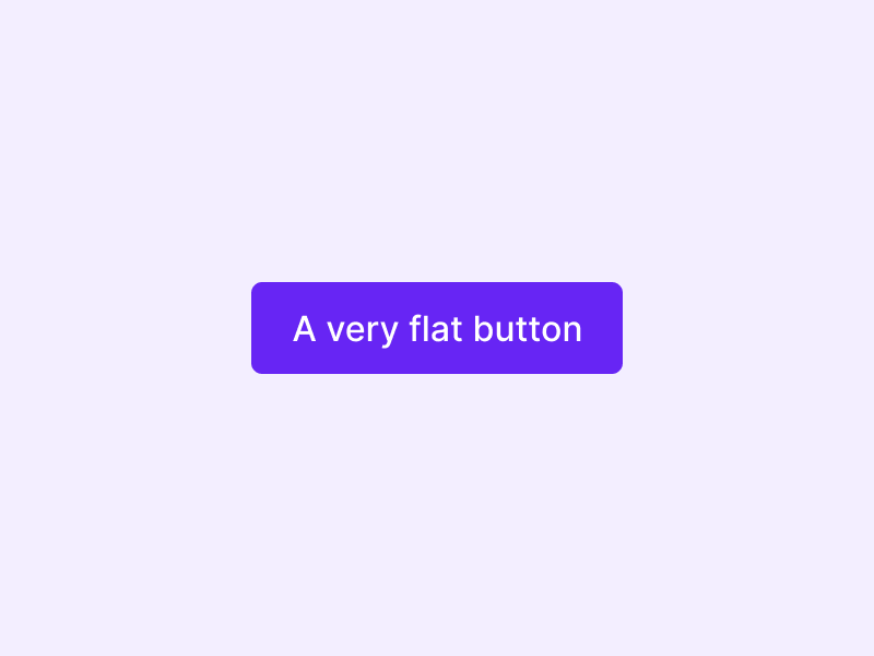
Making people understand they can click on flat buttons
Interactive elements must have enough indications to suggest clickability, regardless of whether you choose a flat design style. It is possible to give interactive components the right look by using cues like borders, color, size, consistency, positioning, and web standards conformance.
Every click is important when using the internet as a tool.
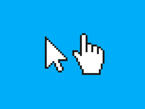
Clickable material must be distinguished from the plain static text for the sake of clarity for the site’s visitors.
People in the online world use their prior knowledge of the world and the web, in particular, to determine what is clickable. Using visual signals that are consistent with people’s expectations helps them rapidly identify which objects to click.
Some website designers are taking a minimalist approach to the extreme because of the flat design trend. The goal of flat design is to reduce the number of options available to the user. However, if too much is removed, the interaction becomes more complicated.
The 3-D effect, which is one of the most vital clickability signifiers, is often omitted in flat designs. There is a noticeable lack of tactile clues for users, making it difficult for them to tell what is clickable from non-clickable.
Tips to improve clickability
Make the buttons look like physical ones or in case of flat buttons, use a clear hover state. The correct visual clues must be retained for an object to be recognized accurately and efficiently.
If you don’t want the 3-D illusion, stick with a rectangular shape. Even in the absence of more opulent effects like shadows and gradients, interactive elements in flat design should be clickable.
- Avoid making non-clickable things resemble buttons. Giving headers a background color, for example, makes them look like buttons when they aren’t actually buttons at all.
- Pay attention to the page’s hierarchy of content. A page shouldn’t have a lot of different-sized, brightly colored boxes. When similar-looking items compete with each other, it’s tough for users to distinguish which ones are clickable.
Summary
User empowerment is lost when users aren’t sure where to click, which is essential for a great experience.
The primary goal of the flat and minimalist design was to remove all of the unnecessary elements from the user interface, leaving only the essentials to draw attention to the content and tasks at hand. Using these design styles incorrectly actually slows down the user experience by thinking more carefully about their options.
Use recommended tips stated in this article to avoid the limitations of flat design in your UI.