

Short answer: 320px.
If you want the most remarkable outcomes, you need to measure your audience and consider how much effort you want to make your site/app work for the 0.1 percent of people below your screen-width threshold.
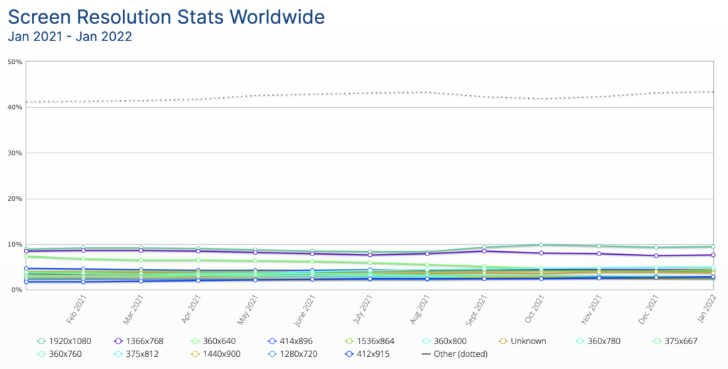
That being said, the vast majority of your users will have screen-width support of at least 320px in width. This means that if your website or web app supports the smallest screen size of 320 pixels, it will be accessible to most of your visitors.
One important thing to consider while designing for different screen sizes is the use cases. On a mobile device, why would someone want to browse your site? Precisely what are they aiming to accomplish? When compared to the desktop experience, how might that differ? What value will it provide your users with?
Check your website analytics as well. Ask yourself more questions: Are people genuinely using small devices to access your website or other websites in your niche? Which pages will they be visiting? How small do they need to be? How much traffic is generated by small devices? It’s preferable to provide a great user experience to the maximum number of people than to make concessions that might negatively impact everyone.
Table of Contents
Responsive design
When it comes to designing websites, responsiveness refers to the ability of a website to perform well on a variety of devices. Many people will reject a website that does not perform effectively on their device. A study found that 80% of users said they would not visit the site in the future.

Practices for implementing responsive design
You may create fluid designs by adjusting the width and height of the design to fit the viewport of any device it is running on. Every viewport that isn’t perfectly aligned with a fixed design layout will have undesirable distortions. Percent units and max-widths can be used to guarantee that the layout suits mobile device viewports without being too wide on desktop viewports.
It’s time to design for mobile-first. Using a mobile-first approach to design is a good idea because smaller screens are more susceptible to friction. A desktop layout is more difficult to resize for a mobile device, while the opposite is true. Designers focus on what is absolutely necessary to provide the best possible user experience while designing mobile-first
It is essential to know your breakpoints. Designers must include a breakpoint when the content appears to be misaligned to make a website responsive. As many devices as possible are being aligned to the site, numerous breakpoints must be specified to ensure responsiveness.
What are my screen size properties?
Curious to learn about the properties that your browser captures? Here is a list. Use the update button to update values once you change height of your browser.
| Property | Size |
|---|---|
| Screen Width | px |
| Available Width | px |
| Outer Width | px |
| Inner Width | px |
| Browser Width | px |
| Document Width | px |
| Screen Height | px |
| Available Height | px |
| Outer Height | px |
| Inner Height | px |
| Browser Height | px |
| Document Height | px |
Conclusion
There is no standard screen size for web design, despite this fact. In some cases, consumers may utilize devices that don’t support the screen sizes and resolutions listed above, depending on the type of website.
If you’re designing a website, you should use analytics to figure out the best screen sizes. Research your audience’s preferred method of communication. If those devices don’t meet the aforementioned resolution, then they should be included in the group.


Hi friends, nice piece of writing and nice arguments commented at
this place, I am truly enjoying by these.