Many applications and websites rely on forms in some capacity. Our personal information is entered into them as well as our log-in credentials. Consider how frequently you enter information into websites and how often you see errors. Navigating through those snags is excruciatingly frustrating. Error messages indicate a system’s functionality, informing users when a problem has occurred and providing solutions. If you’re wondering what language to use, read one of our recent articles. However, for error messages to be effective, users must be able to see, interpret, and act on them without much difficulty.
When utilizing software, people will inevitably make mistakes because we are all human.
When anything goes wrong, an error flow is created to help the user figure out what went wrong and how to fix it. A well-designed error flow makes it easy for users to correct their mistakes and continue with their tasks after they have been interrupted.
When designing error-correction flows, keep these three principles in mind:
- It’s important that the error message is obvious and understandable to the user.
- The incorrect field(s) should be located easily.
- Fixing the problem should not necessitate memorization of the steps.
Whenever possible, try to use inline validation
With inline validation, an error indicator should appear as soon as the user completes a field’s entry. This is ideal, but it is not always possible. In addition, fixing the error instantly once the field has been completed requires users to interact with the least cost: they do not need to locate or navigate to the field, nor do they require context switching from a new field back into an old field they considered they had successfully completed.
In some cases, inline validation will be impractical, and the user’s input will have to be forwarded to a server for review. (Kumar, 2018)
Indicate that a complex field was successfully entered
Successful completion can be indicated with inline validation as well. The green checkmark and the notification stating the user name is accessible allow users to know they may move on to the next step, for instance, if they have to establish a unique username.
Make suggestions for field values, confine inputs to legal values, and be flexible by permitting typos, abbreviations, or various input formats as per the error-prevention principles.
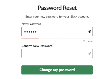
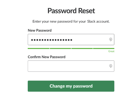
Users will be prevented from guessing or verifying several times if what they’ve entered complies with the criteria given by the system if instant inline validation is used for difficult input such as new passwords.
The password-strength indication changes as the user types in the example below, making it easier for the user to determine if the string typed thus far is strong enough or whether further characters are required.
Color can be used to tell errors apart from normal states in a field
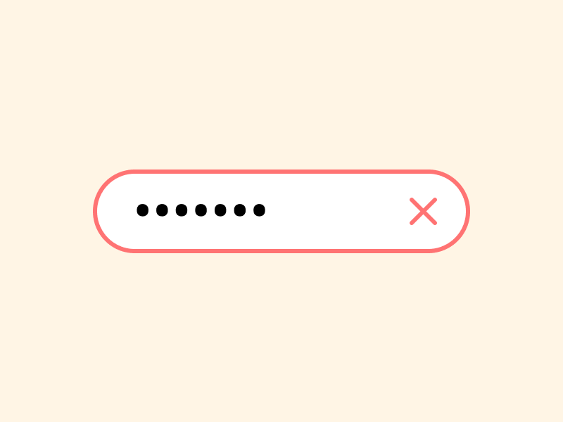
Aside from orange or yellow, red is the most closely associated color with errors. Ensure the validation text is a different color from the rest of the form’s content so that the user can immediately spot it. The error field should have a semi-transparent backdrop of the same color to make it stand out on a long site with several form fields.