For the UX of web and mobile forms, you have to keep several things in mind. One of them is error prevention by disabling the Submit or Continue button. But you should not silently disable it. Users should know what they need to do next. Let’s discuss some of the best practices for designing the Submit buttons in forms.
If the user has made some mistakes in the form, you don’t want them to hit the Submit button and create errors. You want them to correct the mistakes first.
There are two ways to disable the Submit button. You can disable it until the user has filled in all the fields, or you can disable it if the user has made any mistakes.
Table of Contents
Pre-submission
If you disable the Submit button until the user has filled in all the fields, it’s called a “mandatory field.” When the user fills in all the required fields, the Submit button will be enabled. This is the best way to prevent users from submitting the form with errors. In this case, you need to show a tooltip and the reason why the button has been disabled.
Post-submission
If you disable the Submit button if the user has made any mistakes, it’s called a “field validation.” This is not as good as the mandatory field because the user might not know which fields are wrong. They have to guess or scan the page for the fields that are wrong and correct them. If you go with this method, make sure you highlight the field and scroll to the first field that has the error.
You should never silently disable the submit button without showing an error message. This will frustrate the user and they will have no idea what they need to do to fix the form.
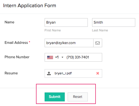
Designing the Submit button
Now that you know when to disable the Submit button, let’s discuss how to design it. The Submit button should be visually different from other buttons on the form. It should be big and easily visible. It should also have a clear label, such as “Submit.”
It’s also important to use the right color for the Submit button. The button should be different from the background color, and it should be easy to see. You can use a different color for the button depending on the status. For example, you can use a green button if the form is valid and a red button if the form is invalid.
Conclusion
In conclusion, you should always disable the Submit button if the user has made any mistakes AND mention why. You should use a tooltip to explain why the button is disabled. The Submit button should be visually different from other buttons on the form, and it should have a clear label. The button can also have a different color depending on the status.