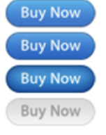
The button hover states come in different shapes and sizes. The pattern you use doesn’t matter, as long as it makes sense for your application because there isn’t a pattern common enough to be deemed “standard” for this by most people.
When someone uses a website, they aren’t going to claim, “it turned to dark on hover instead of bright; thus it must be something else.”
The inclusion of a clickable modification to the pointer is purely for informational purposes. Design and aesthetics matter more than utility in determining what the change is.
This is the only rule you must adhere to.
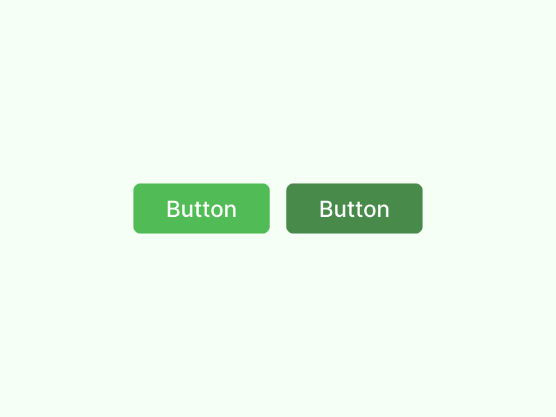
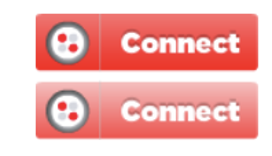
When you hover over an item, you want to make it stand out (or “pop”) from the rest of the clutter.
To make the button stand out on a white background, use a darker color for the text.
To make the button stand out against the black background, use LIGHTEN to increase the contrast.
A final piece of advice: drop shadows should be placed BELOW the text, not on top of it. Your drawings might seem menacing if you used shadows in this way. To distinguish a bad character in a film, a typical technique is to shine the light source from BELOW the figure.
A mental picture of the UI buttons, at the very least, would help shed light on this question.
Feedback
Just like with most physical buttons, users simply touch it if they wish to press a button. A person’s impression is based on how it looks and feels (it looks like a button; it feels like it can be pressed by actually pressing it).
The following information could be provided to a user through the usage of UI buttons:
Aesthetics
- It appears to be a button.
Accessibility
- According to the description, it’s a button.
- It looks clickable.
- Using visual design strategies, a designer can enhance the user’s impression that the button does what it’s supposed to.
The source of illumination
It’s important to consider the source of illumination on button hover state. When hovered over, does the button rise? Alternatively, does it move? If we’re looking up, then the shade gets lighter as it gets closer to the light source, which is always above us (in the real world). Down, then darker.
LED Lighting
When hovered over, is the button illuminated?
If this is the case, then the shade gets brighter, regardless of whether the light originates from the button itself or only from the surrounding area.
Even though you can use a variety of ways, these are the main reasons why the color of a button changes when it has hovered over.
Because the mouse’s pointer transitions into an actual clickable button, you should be aware that for pointing devices, this is enough feedback to make the button feel clickable.
A user must press it in order for it to appear clickable on touch devices.