We’re often asked: Should the Cancel button appear first or second? The importance of platform standards outweighs the importance of positioning buttons in a single space. So make sure you position the buttons consistently. The more widely used pattern for Mac users is for cancel button to be on the left, and the default action to be on the right.
Let’s say you’re designing for Apple users. Make the most frequently used button the default and make it stand out by placing it on the right. On the right because the right side represents where the next page is placed (in the users’ mental model). If it is an irreversible action, you should not make it a default in order to prevent users from hitting Enter and mistakenly taking that action.
When naming a button, it’s better to clarify what it does rather than just labeling it as “button” (like “OK”). Users are more confident in their actions when they have a specific label to guide them.
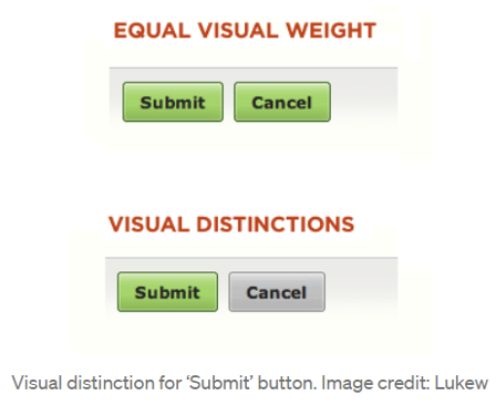
To answer the most popular question among designers, ‘Which button should come first—OK or Cancel?‘, we’ve outlined the basic UX moments for action buttons in this post. You need to utilise button weights to distinguish between two possibilities. Attention will be drawn to the button with the most visual weight.
The decision becomes trickier if you’re creating a web-based application. Firstly, utilise web analytics to determine which platform is the most used by your users and then follow the button order for that platform (i.e. if the majority of your visitors come from Windows OS, you can follow Microsoft guidelines).
Due to the variety of operating systems, the button sequence you set will not be consistent with the OS for all of your users. The user’s reading habits should be taken into consideration while selecting button sequences.
Users are encouraged to execute the desired action by clicking on a button. The buttons in your product, including system dialogues, should always be designed to be easily recognized and understandable.
The answer can be found in the system’s user interface guidelines.
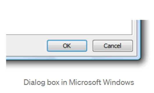
For Microsoft’s operating system
The following is the order in which the commit buttons should appear:
- Don’t/No
- Cancel
So the Cancel button is always to the right of the OK button.
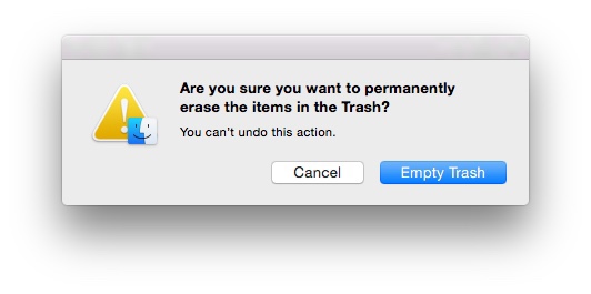
For the Mac OS operating system
- The button on the far right is the one that starts the action. To the left of this button is the Cancel button.
It’s, therefore, on MacOS’s left of the OK button that you’ll find Cancel.
To use on the Android platform
- There is always a dismissive action on the left side of a dialogue. Dismissive actions bring the user back to their former status.
- Affirmative acts are located on the right side. Progress toward the user’s goal is maintained when the user responds positively to the dialogue.
Right next to OK, there’s a Cancel option for Android devices.