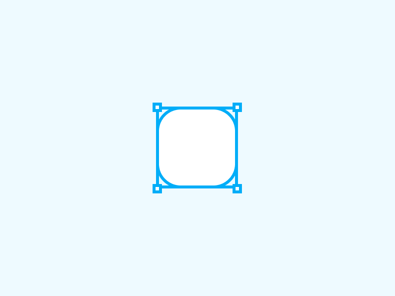
The beauty of rounded corners can be appreciated by everyone, but not everyone understands how it is achieved. Some scientists believe that rectangles with rounded corners are easier on the eyes since they require less cognitive work to perceive visually.
In terms of processing circles, the fovea is the fastest.
There are more “neuronal image tools” in the brain while processing edges. It’s easier to work with rounded rectangles because they look more like circles than squares.
In addition, the sharper the corner, the more vibrant it appears and the more difficult it is to look at it.
One of the reasons why we’re drawn to rounded corners is that they’re more in line with our regular use of the actual world, which makes them more appealing. You can find them just about anywhere. Children immediately learn that sharp angles hurt, and rounder corners are more protective. That’s why most parents don’t freak out when their kids play with a ball.
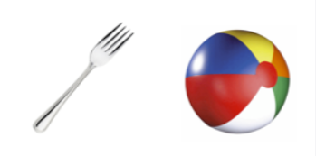
A fork, on the other hand, would be taken away from a youngster for fear of harming the child. Neuroscience refers to this as an “avoidance response” with sharp edges, which happens. Since sharp edges in nature can present a hazard, we tend to avoid them.
Table of Contents
How do rounded corners affect usability?
Designers and brand owners are frequently confronted with questions that seem insignificant at the time. Many times, we wonder if these seemingly inconsequential decisions have any impact on the users or the company and the answer is yes, they absolutely do, and they are, in fact, not as trivial as they might seem.
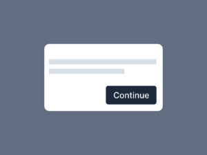
In interfaces with ample area, rounded buttons are an excellent choice. The positioning of fully rounded green buttons in Spotify’s mobile and web apps is highly effective at drawing users’ attention to buttons that demand action.
In the context of the Spotify user experience, which focuses on music, podcasts, and playlists, the app’s core interaction is simple.
Users are more likely to tap on “play” when they see full-rounded play buttons instead of the album and list UIs.
Aesthetics of such buttons
As a designer, you have the power to create a consistent, distinctive brand identity that customers instinctively associate with your product or service if you grasp how basic shapes affect perception.

Modern-looking corners have rounded edges. It all started with mobile devices and subsequently spread to online interfaces. Openness and positivity are conveyed by rounded corners. It’s possible that rounded corners were adopted by various design systems and utilized widely in icons, buttons, and pictures.
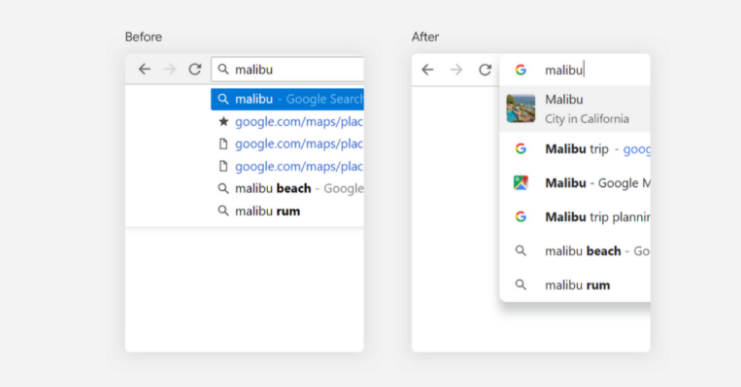
Using a rounded address bar in Chrome’s recent update indicates that the browser can merge with Google’s rounded Google search bar on mobile. During typing, users can see a glimpse of the search results on the next page.
Drawbacks of using rounded buttons
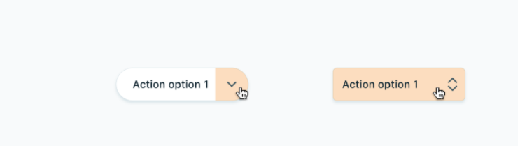
- Buttons with rounded corners resemble tags.
- When it comes to presenting nested options, rounded buttons fail.
Summary
When it comes to buttons, there is no right or wrong way to make them look. User interaction should be encouraged, encouraged, and empowered by a button’s corner radius as small as possible.