It all comes down to who your target audience is. It’s fine to use the HH:MM notation to display duration in labor-intensive situations because most people are familiar with it. However, even in those conditions, it’s possible to get time mixed up.
Table of Contents
Is there a better way to accomplish this?
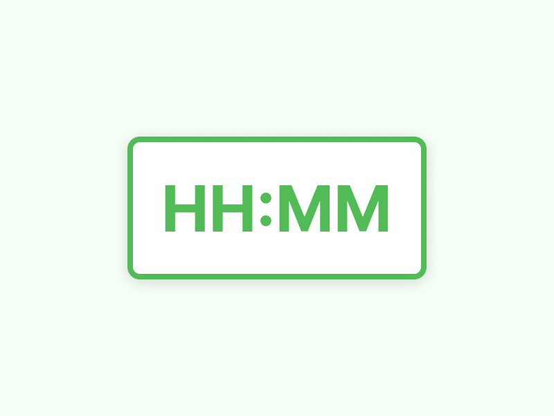
To begin, let’s go with the current solution. HH:MM has the following advantages:
It’s a standard way of expressing the passage of time.
It’s easy to scan when there is a lot of data in a grid because the HH:MM aligns beautifully.
In light of this, the following are two possible strategies. It’s possible to label the current table to indicate that it’s showing time instead of duration, although it’s not a need. You might also use a different notation to represent its length, such as:
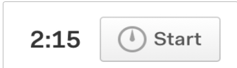
These days, the prevalent notation on the left keeps some scannability while more clearly indicating duration. By making use of the top-left corner, the technique on the right maintains the orderliness of the HH:MM notation.
Either HH:MM or decimal time can be displayed on your timesheets. Everyone on the team will see this because it’s a global setting.
HH:MM time
Decimal time

Rules for expressing time in UI & UX Design
Here are some handy tips you should keep in mind when you want to display duration:
Non-plural entities should be used for singular units.
It is not necessary to code the interface to say “1 minutes” when using a single unit of time (e.g. “1 minute, 1 second”). That’s just sloppy coding.
You should spend a few extra minutes coding your progress indicator such that one minute or one second (singular units of exactly 1) are written in the singular voice, while more than one minute is written in the plural voice. This only serves to elevate the overall quality of your application.
Consistency is key, whether you use numbers or words.
This process will take anywhere from one to two minutes, depending on how you define the time in terms of numbers or words. You should keep in mind that double-digit figures are best expressed as numbers rather than words since they are more easily processed by our brains.
Avoid ambiguity when it comes to your topic.
Don’t use phrases like “a few minutes” or “a few hours.” There is no specificity in these terms. There is a good chance they will annoy your user more than if you did nothing at all. A user should know how long it will take a process to complete and how long they should expect it to take.
To improve your system’s representation of time, apply the methods listed above. It will also help you reduce wait times for your users by giving them more specificity.