

“Toggles” are UI controls that have two mutually exclusive states, such as ON and OFF. UXers should understand how to design effective toggle buttons. The design and functionality of this control are based on a physical switch that allows users to toggle on or off various functions (i.e., light switch). Toggle switches have been around for a while, but many designers continue to overlook them.
These toggle or ‘flip-flop’ button controls are a great way to get the job done quickly and easily. They conserve space by using a single control to control two different options. Flip-flop controls have an issue since they don’t tell the user of their current status, which is the second duty of every control.
By displaying text outside of the button, rather than on it, a toggle switch can show its current state and the state it will change to.
The toggle should have a default value at all times.
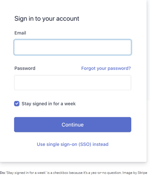
Pre-selected default states are included in toggles (either ON or OFF). It’s advisable to utilize a checkbox if you need to allow users to make a choice (i.e. the user needs to answer ‘yes’ or ‘no’).
Labels that are well-written are essential.
The toggle switch is easier to grasp if it has clear labels. You should clearly show which state is on. When a toggle is labeled, it is evident which choice it controls and what state the toggle is now in.
The following are a few things to keep in mind while you’re writing product labels:
- Make it easy for customers to find what they’re looking for. Toggle labels should explain what the control does when the switch is turned on.
- Labels of the toggle buttons should be brief and to the point. Attempt to keep the number of words to a minimum. Toggle controls should be labeled with one or two words, preferably nouns, that describe their function.
For example:
Do: Do you want to know the average price?
Don’t: Display the average price.
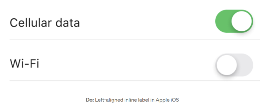
- Use the inline label with the left alignment. Users will have an easier time understanding labels if they are on the left side of the switch. Labels that are aligned to the left of the layout are the most effective (in Western culture, people read from left to right).
Toggle-activated actions should take effect instantly.
Another pro tip Toggles should not necessitate a Save or Confirm button for users to apply a new state. Since users must hit the Submit button to make changes, it is best to avoid utilizing toggles in long forms if other sorts of form fields are present. In this scenario, a single checkbox is preferable to a toggle switch.
It’s possible to add a processing status loop animation if instant results are not possible due to system delays (sometimes it takes a few seconds for the system to change state. However, keep in mind that the procedure should not take longer than a few seconds.


A quite excellent article. We feel thankful for your blog article. I have found a good lot of strategies after visiting your article.
I like the way you write and share your specialized niche! Some what interesting and several! Keep it coming!
A quite excellent writing. We have always been thankful for your site post. I have found the lot of strategies soon after visiting your blog post.
Excellent blog, continue the good work!