
Why are keyboard keys staggered?
Reading Time – 2 minOn every keyboard, the keys are staggered a little amount to the left of the previous row. Both Q and A are located above and somewhat to the left of Z. This is a recurring theme…


Reading Time – 2 minOn every keyboard, the keys are staggered a little amount to the left of the previous row. Both Q and A are located above and somewhat to the left of Z. This is a recurring theme…
Reading Time – 3 minThere are some differences between the Search function and the Filter function. The Filter function is used to filter out the unwanted results and the Search function is used to find an information manually. In Google,…
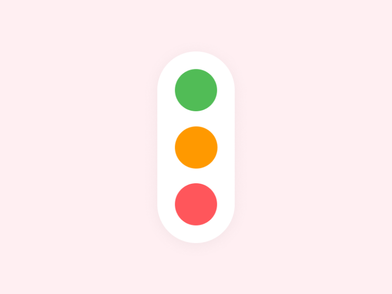
Reading Time – 3 minThe internet is full of traffic signal concept designs. Designs for traffic lights can be found in several of these concepts. It’s possible to display animations or a variety of colors in a single module, which…
Reading Time – 3 minUser interface (UI) design is a method used by designers to create user interfaces for software and electronic devices. Designers strive to build user-friendly interfaces that are also enjoyable to use. In addition to graphical user…

Reading Time – 3 minDigital audio files of conversations about UX Design are collected in an episodic series known as the UX Design Podcasts. Think of it as a collection of recorded conversations regarding user experience design. These audio files…

Reading Time – 2 minGenerally, the label is placed to the right of the control by the designer. What you’re sensing is most likely the rationale. There are no gaps between labels and controls in this layout when you use…
Reading Time – 3 minUser interaction habits are altering as a result of flat buttons, and we can observe this in usability testing results. Users are compelled to sift through pages in order to discover what links can be clicked.…
Reading Time – 2 minUsing an optimal font size is important. When developing a design system, designers and developers must work together closely, particularly when it comes to typography. Typography designers have been discussing the relationship between horizontal and vertical…

Reading Time – 2 minReadability is the ease with which a piece of writing can be understood by a particular audience. The difficulty of your writing is an important factor in its readability. If a sentence is difficult to understand,…
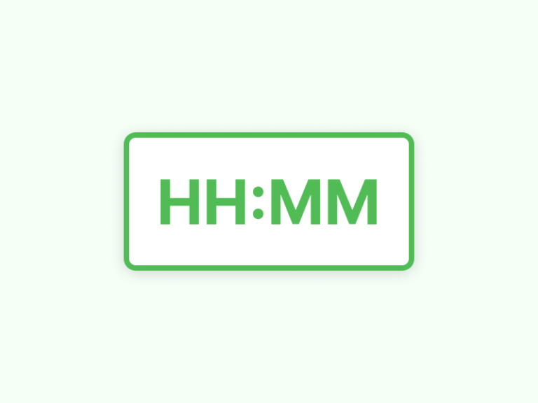
Reading Time – 2 minIt all comes down to who your target audience is. It’s fine to use the HH:MM notation to display duration in labor-intensive situations because most people are familiar with it. However, even in those conditions, it’s…